Key Takeaways
- Skeleton screens serve as visual placeholders during content loading, improving perceived performance and user engagement.
- Accurate representation of content layout in skeleton screens is crucial for helping users orient themselves as content loads.
- Well-timed, subtle animations provide positive feedback, but excessive motion should be avoided for inclusivity.
- Accessibility needs must be met, including support for ARIA attributes and motion sensitivity preferences.
- Over-complication and inaccurate placement are frequent mistakes to avoid when designing skeleton screens.
Table of Contents
- Understanding Skeleton Screens
- Design Principles for Effective Skeleton Screens
- Animation Techniques and Timing
- Accessibility Considerations
- Common Mistakes to Avoid
- Conclusion
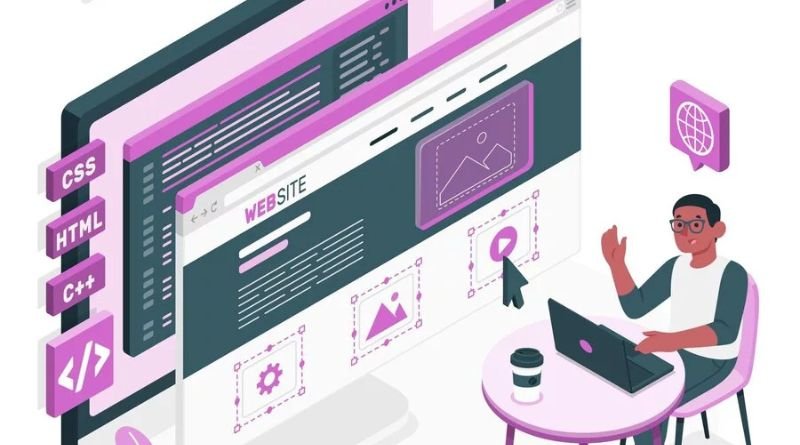
Skeleton screens have become a staple of modern web design, providing users with a visual cue during content loading. When implemented effectively, they can enhance user experience by reducing perceived wait times. For designers and developers aiming to craft intuitive interfaces, understanding the concept of skeleton loading UI is essential, as these placeholders are now standard in top-tier digital products.
Presenting a placeholder similar to actual content layout helps users orient themselves and reduces frustration while waiting for data. Skeleton screens reassure visitors and enable smoother navigation. This guide discusses strategies for creating effective, visually consistent, and accessible skeleton screens.
The use of skeleton screens in UX has prompted brands and designers to share their solutions, raising expectations for user-friendly loading. Whether for e-commerce, news, or SaaS, well-designed skeleton screens can reduce bounce rates and increase engagement.
This article covers best practices, accessibility guidelines, and pitfalls to stay current with user-centered web design.
Understanding Skeleton Screens
Skeleton screens are UI placeholders that mimic the basic structure of the content being fetched from the server. These visually neutral frameworks use rectangles and simple shapes instead of images and text, allowing users to anticipate where important information will appear once the loading completes. Unlike spinners or progress bars that merely imply a wait, skeleton screens directly engage the user in the eventual structure, encouraging them to stay on the page.
Their effectiveness lies in helping users maintain their mental model of the interface, reducing cognitive fatigue and the likelihood of abandoning the page. Recent studies, including those covered by Nielsen Norman Group, have shown that skeleton screens offer a more satisfying wait experience than traditional loading animations or blank loaders.
Design Principles for Effective Skeleton Screens
Effective skeleton screens are never an afterthought. Designers should begin by analyzing the hierarchy of real content and mapping skeleton placeholders to match the scale and position of future elements.
- Match Content Layout: A successful skeleton screen aligns closely with the actual content’s spatial arrangement. This precise mapping helps users maintain focus and avoid confusion during loading transitions.
- Use Neutral Colors: Select neutral shades, such as soft grays or light pastels, that are clearly distinguishable as temporary but do not overpower the finished UI. Such color choices ensure the loading screen does not distract from or clash with the content as it loads.
- Maintain Visual Hierarchy: Establish a hierarchy by ensuring critical regions, such as titles or images, are more prominent than secondary sections. This clarifies what elements users should expect to appear first.
Animation Techniques and Timing
When thoughtfully applied, animation can make skeleton screens feel more dynamic, indicating that loading is in progress without causing distraction. The most common and effective pattern, the shimmer or wave animation, introduces motion across placeholders at a consistent speed.
- Shimmer Effect: This subtle animation provides users with immediate visual reassurance that the content is actively loading and that the page is responsive.
- Optimal Timing: Set animation intervals to 1.5-2 seconds per cycle. This keeps the effect noticeable but not overwhelming, offering a relaxed, pleasant loading experience for users.
Maintaining harmony in animation speed and style across different UI components prevents cognitive dissonance and promotes a smooth transition from the loading state to full content display.
Accessibility Considerations
Inclusive design is essential in web UI development, particularly when creating experiences that involve loading states. Skeleton screens should support a broad spectrum of users, including those who use assistive technology or are sensitive to motion.
- Screen Reader Compatibility: Apply meaningful ARIA attributes aria-busy=”true” to indicate that the content is still loading. This ensures that users relying on screen readers are informed and not left confused by placeholder content.
- Motion Sensitivity: Because some users experience discomfort from animated effects, developers must respect system-level preferences like the prefers-reduced-motion CSS media query, disabling or simplifying animations as required.
Common Mistakes to Avoid
Overreliance on skeleton screens to camouflage slow backends or unnecessarily elaborate placeholder designs can quickly harm rather than help user experience.
- Overcomplicating Design: Add only enough detail to suggest where future content will be located. Avoid patterns, decorations, or icons that might be mistaken for actual content.
- Inaccurate Placeholders: Precisely mirror the eventual size and shape of images, headlines, or blocks. Very different proportions or layouts may cause a jarring “content shift” when the data loads.
- Ignoring Performance Optimization:Skeleton screens should supplement, not replace, true performance optimizations. Prioritize efficient loading, caching, and code splitting to ensure underlying speed remains a focus.
Conclusion
Designing and implementing excellent skeleton screens is a blend of technical skill and user empathy. From closely matching content layouts and maintaining visual hierarchy, to adding subtle animation and supporting accessibility needs, each decision contributes to a smoother, more delightful experience during loading states. By following the best practices outlined here, you’ll ensure your digital products keep users informed, engaged, and satisfied, even when they are forced to wait.